How to Evaluate Probabilistic Forecasts with Weighted Quantile Loss

Introduction
So, there I was, reading this paper on time series models, and suddenly I hit a section that made me go, "WTF?" The model didn’t just spit out a single predicted value; instead, it produced a whole range of predictions. My brain instantly went into overdrive—how on earth are you supposed to evaluate that? I’m used to straightforward metrics like RMSE or MAD, where you basically compute the difference between the actual and predicted values. But now, the predicted value has multiple numbers, and let’s just say, my head was ready to explode 😅
That’s when the author introduced Weighted Quantile Loss, and I knew I had to dive deep into it and put together this guide to help folks understand it just as clearly.
By the end of this article, you’ll know exactly how to calculate this metric and, more importantly, how to interpret it so you can evaluate your probabilistic forecasts with confidence.
The Quantile Loss Formula
Alright, let’s start with the formula for Quantile Loss:
But honestly, who has time for math? Let’s break this down in a way that actually makes sense—using code!
First, we’ll define some simple dummy data for our predictions at quantile , , and actual values, :
import numpy as np

prediction = np.array([1, 2, 3, 4, 5])
actual = np.array([10, 22, 30, 40, 51])
quantile = 0.1
Now, let’s calculate the quantile loss for our predictions at quantile at each timestep :
def quantile_loss(alpha, q, x):
    return np.where(x > q, alpha * (x - q), (1 - alpha) * (q - x))

metrics = quantile_loss(quantile, prediction, actual)
print(metrics)
Here’s what this code does:
- Alpha (α) is our quantile (0.1 in this case)
- represents the predicted values
- is the actual observed values
The np.where function helps us calculate the loss by applying the appropriate formula based on whether the actual value is greater than the predicted value or not.
When you run this with the dummy parameters, you get:
# Output: array([0.9, 2. , 2.7, 3.6, 4.6])
What you’re looking at here is the quantile loss for each prediction when . The numbers tell you how well your prediction did relative to the actual value, penalizing overestimates and underestimates differently depending on your chosen quantile (more on this later).
Aggregating The Quantile Loss
In practice, we don’t just compute the quantile loss for one quantile. Real-world applications often require producing probabilistic forecasts across multiple quantiles. So, let’s see how to aggregate the quantile losses from a model’s probabilistic prediction.
Let’s walk through the calculation using this dummy dataset:
data = {
        "label": np.array([3, 5, 7]), # the actual values
        "0.5": np.array([3.0, 5.0, 7.0]), # the model's predictions when the quantile is alpha = 0.5
        "0.1":  np.array([2.5, 4.5, 6.5]), # the model's predictions when the quantile is alpha = 0.1
        "0.9": np.array([3.5, 5.5, 7.5]), # the model's predictions when the quantile is alpha = 0.9
    }
First, we’ll calculate the quantile loss for each quantile:
quantiles = [0.1, 0.5, 0.9]
quantile_losses = {}

# Calculate quantile loss at each time step for each quantile
for quantile in quantiles:
    ql = quantile_loss(quantile, prediction, actual)
    quantile_losses[str(quantile)] = ql
    print(f"Quantile Loss for {quantile}: {ql}")
When you run this, it calculates the quantile loss for at each timestep, to , for each quantile (0.1, 0.5, and 0.9) and prints the results:
# Output:
# Quantile Loss for 0.1: [0.05 0.05 0.05]
# Quantile Loss for 0.5: [0. 0. 0.]
# Quantile Loss for 0.9: [0.05 0.05 0.05]
Now, let’s aggregate these losses over time steps with a weight. The weight might look a bit weird, but don’t worry—we’ll get into why it’s important soon.
# Aggregate each quantile over time steps with a weight
aggregated_qls = {}
weight = 2/np.abs(actual).sum()
for quantile in quantiles:
    ql = quantile_losses[str(quantile)]
    aggregated_ql = np.sum(ql) * weight
    aggregated_qls[str(quantile)] = aggregated_ql
    print(f"Aggregated Quantile Loss for {quantile}: {aggregated_ql}")
Here’s what happens:
- For each quantile, we sum the quantile losses across all time steps.
- Then, we multiply this sum by a weight. The weight is designed to normalize the loss based on the magnitude of the actual values, which helps make the loss values comparable across different datasets.
The output will be:
# Output:
# Aggregated Quantile Loss for 0.1: 0.020000000000000004
# Aggregated Quantile Loss for 0.5: 0.0
# Aggregated Quantile Loss for 0.9: 0.019999999999999997
Finally, to get the overall metric, we just take a simple average of these aggregated losses:
# Now just do a simple average
simple_average = np.mean(list(aggregated_qls.values()))
print(f"Simple Average: {simple_average}")
In the code above, we sum the aggregated quantile losses and divide by 3 (because we calculated 3 quantiles—0.1, 0.5, and 0.9). This gives:
# Output: Simple Average: 0.013333333333333334
And just like that, you’ve calculated the Weighted Quantile Loss (WQL)!
Making Sense of Quantile Loss
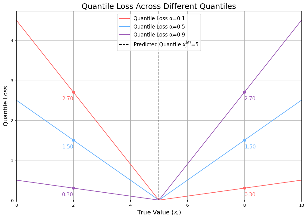
So, we've walked through how to calculate quantile loss, but what does it really mean? To get a clearer picture, let's look at the chart below, which visualizes the quantile loss across different quantiles:

Breaking Down the Chart
In this chart, you’re seeing how the quantile loss behaves depending on the true value, and the predicted quantile, . The different colored lines represent the quantile losses at three different quantile levels: , and, .
Now, here’s the key thing to understand:
When the predicted value is equal to the true value, the loss is 0—no surprise there! Things start to get interesting when they’re not the same.
Quantile
Let’s start with . Take a look at what happens when the true value is 8 (meaning we underestimated by 3). The quantile loss shoots up to 2.7. But if the true value is actually 2 (so we’ve overestimated by 3), the loss is just 0.3. Why the difference?
When we make a prediction at the 0.9 quantile, we’re saying we’re 90% confident the true value will lie below that number. So, when the true value ends up being higher, it means our model really messed up, and we penalize it more. Notice how the rate of loss for both under and overestimation is linear but at different rates—steeper when we’re underestimating, which is what we expect from a high quantile.
Quantile
Now, let’s flip the script with . Here’s where it gets interesting in the opposite direction. If the true value is 8 (and we’ve underestimated by 3), the loss is just 0.3. But if the true value is 2 (we overestimate by 3), the loss jumps to 2.7. This happens because, at , we’re saying there’s only a 10% chance the true value will be below our prediction. If it’s actually below, that’s a big miss, and the model takes a larger hit.
Quantile
Finally, let’s talk about . This one’s special because it’s right in the middle—the median. Here, the losses for overestimation and underestimation are perfectly symmetric. If you look at the chart, you’ll see the loss increases at the same rate whether you’re predicting too high or too low. This is because the quantile loss at is actually just a scaled version of the Mean Absolute Deviation (MAD) loss.
How does the formula simplify? Check it out:
For :
This simplifies to:
Which is exactly half of the MAD loss. So, when , the quantile loss is just a scaled version of MAD (with 0.5 being the scaling factor), penalizing errors equally on both sides.
Connecting It All Back to Weighted Quantile Loss
The quantile loss can be seen as a metric that measures the error between the predicted and true values with a custom penalty. The penalty depends on whether the error is an over- or underestimation and how confident the model was—where a higher quantile means more confidence.
When you aggregate these losses (as we did earlier), you get a more nuanced understanding of your model’s performance. Instead of relying on a single accuracy metric, you gain a comprehensive summary of how your model’s errors are distributed across different scenarios. This approach is invaluable when you need a single number to compare the performance of different models.
The Relationship Between Prediction Quality and Weighted Quantile Loss
Now that we've covered the theory, let’s see how different prediction qualities impact WQL by considering the following three key scenarios: Overestimation, Underestimation, and Accurate Prediction. We’ll walk through each one and examine how they influence the WQL.
Overestimation Scenario

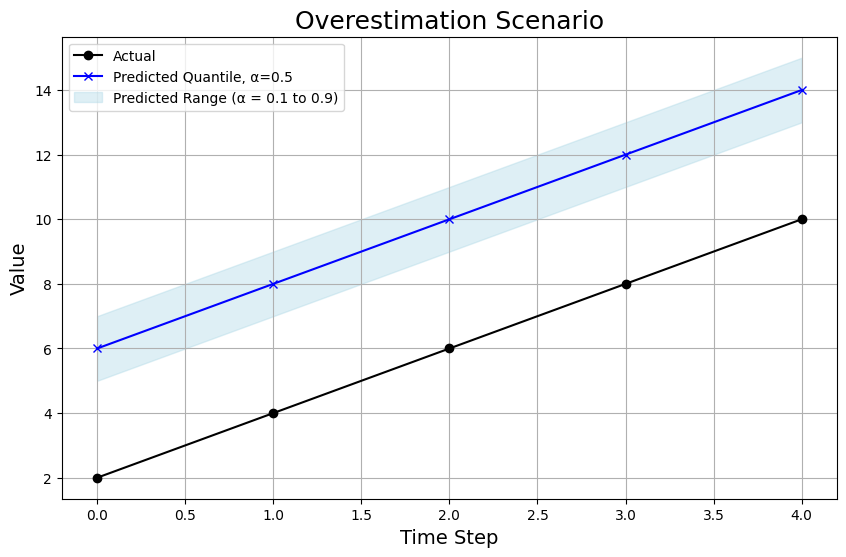
In the overestimation scenario, the model’s predictions are consistently above the true values:
-
Chart Breakdown: Not only is the 0.5 quantile prediction (the blue line) way above the actual values (black line), but even the 0.1 and 0.9 quantile predictions are overshooting (as we can see from the shaded area). This shows the model is too optimistic across the board.
-
WQL: The WQL in this scenario is 0.58.
Underestimation Scenario

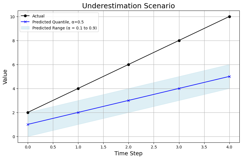
In the underestimation scenario, the model consistently predicts values below the actual ones:
-
Chart Breakdown: Here, the predictions at the 0.5 quantile (blue line) are below the true values, and the entire prediction range (shaded area) is also lower. However, the absolute errors aren’t as severe as in the overestimation scenario.
-
WQL: The WQL in this scenario is 0.41, reflecting a poor model but not as bad as the overestimation scenario.
Accurate Prediction Scenario

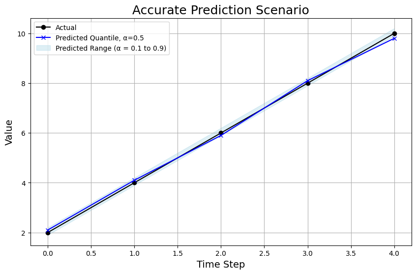
In the accurate prediction scenario, the model’s predictions closely match the actual values:
-
Chart Breakdown: The 0.5 quantile prediction is very close to the actual values, and the range of predictions is tighter, indicating the model is very confident in its predictions.
-
WQL: With such a tight prediction range that is actually highly accurate, the WQL is practically zero at 0.01.
Conclusion
In this post, we explored the ins and outs of Weighted Quantile Loss (WQL), from understanding the formulas to interpreting it across different prediction scenarios. WQL offers a practical way to understand your model's performance, provided it can spit out a distribution of predictions instead of just a point estimate.
What challenges have you faced with evaluating probabilistic forecasts? Share your thoughts or questions in the comments!
